Art and the eye
An ophthalmologist on how we see color
I am an ophthalmologist who loves art. While I have studied the physiology of the retina, I have also studied the role of vision in art. And I have seen how exposure to art and to the humanities is useful to medical students: Art appreciation won’t cure kidney disease, but it enlarges experience, culture and communication — and in that sense helps make better doctors.
I’ve taught undergraduates, medical students and physicians at Stanford for many years about vision and art, exploring how eyes are built, how they process visual information and how they are affected by disease.
Of all aspects of vision, color always seems especially fascinating. And yet, color is a strangely superimposed sense because our ability to see different hues evolved long after retinal circuitry was developed for contrast, form, depth and motion (which depend only on brightness). Thus, color vision has surprising implications for art, beyond the mere presence of a spectrum — and art can elucidate the physiology.
What follows is a collection of insights into how we see color and how artists use it, consciously or unconsciously, to shape their work.
Photoreceptor cells in our retinas (the rods and cones) receive light and change it to a neural signal. But they cannot transmit images directly to the brain because we have 120 million photoreceptor cells and only 1 million optic nerve fibers. The retina must code and simplify the visual information, and in a very real sense we begin to think about what we see inside the eye. Retina is embryologically brain, and retinal cells process the photoreceptor signals to recognize contrast and to fix upon light-dark boundaries. This codified information, such as the edges of objects or faces, lets the brain reconstruct a visual world.
Where does color fit into this system? Humans can see a wide range of colors because we have three different types of cone photoreceptor cells. The rod cells are sensitive only to dim light and serve our night vision without seeing color. The cones work over a broad range of brighter light, and each of our cone types is predominantly sensitive to blue, red or green light. However, even though different colors produce a different pattern of stimulation among the three cones, color recognition is not quite so simple.

Because the innate circuitry in the retina is wired for comparisons and contrast, colors must also be analyzed this way. The retina actually compares the amount of blueness with yellowness, and redness with greenness, and it is the balance of these comparisons (rather than absolute wavelength) that ultimately allows the brain to recognize a sensation of color. And there is another problem.
Although colors are analyzed by blue-yellow and red-green comparisons, the basic circuitry that identifies edges, form, motion and depth responds only to changes in brightness. These discriminations are colorblind, and the sensation of color is superimposed later in the brain upon a “black and white” image of the world.
One positive effect of the comparative nature of color perception is that it helps us maintain constancy in the way we see colored objects under different conditions. It would be distressing, for example, if faces changed color when we went from indoor lighting to outdoor lighting.
This is illustrated in Figure 1, which shows a Rubik’s Cube in white, yellow or blue light. We recognize the different colors on the cube despite the altered illumination because their relationships to each other within each cube are unchanged (even though two “red” squares have quite different colors when seen in isolation above the photographs).
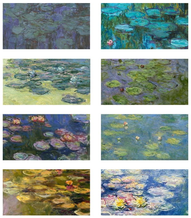
Artists have to face this same perceptual conundrum, especially an artist like Claude Monet, who liked to paint the same scene in different seasons and lighting — creating, for example, 25 paintings of haystacks, more than 30 of Rouen Cathedral and roughly 250 of water lilies in his garden. He had to make decisions on whether to paint what he perceived or what he knew to be true. Figure 2 shows some of the variations in colors of his water lily leaves.
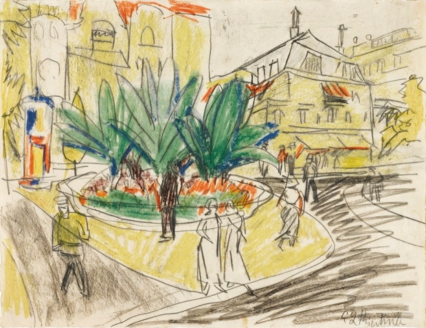

The fact that brightness trumps color in judging form is well-illustrated in Figure 3, which shows a drawing by German expressionist Ernst Ludwig Kirchner, with yellow buildings and green trees — except that none of the colors are placed accurately within the lines.
Somehow this is not very disturbing, and the drawing is lovely, because we recognize the subjects from the sharp black outlines that stimulate form and depth perception. Our brain fills in the colors for us.
An even more striking illustration depends on the property of “equiluminance,” or equal brightness.
Since we need light-dark contrast for recognition of objects and depth, different colors that have the same physical brightness do not define objects very well.
Figure 4 shows a simple statement that would be clear in black print, but it is nearly invisible when written in green letters with the same luminance as the red background. The text disappears in a grayscale (brightness-sensitive) image.
Artists are taught in school not only about colors having hue and saturation, but also having “value” — the art-speak term for brightness. Awareness of value is necessary to avoid unwanted illusions, such as an image that’s barely discernible from its background. Kirchner again gives us a good example, as you can see in Figure 5.
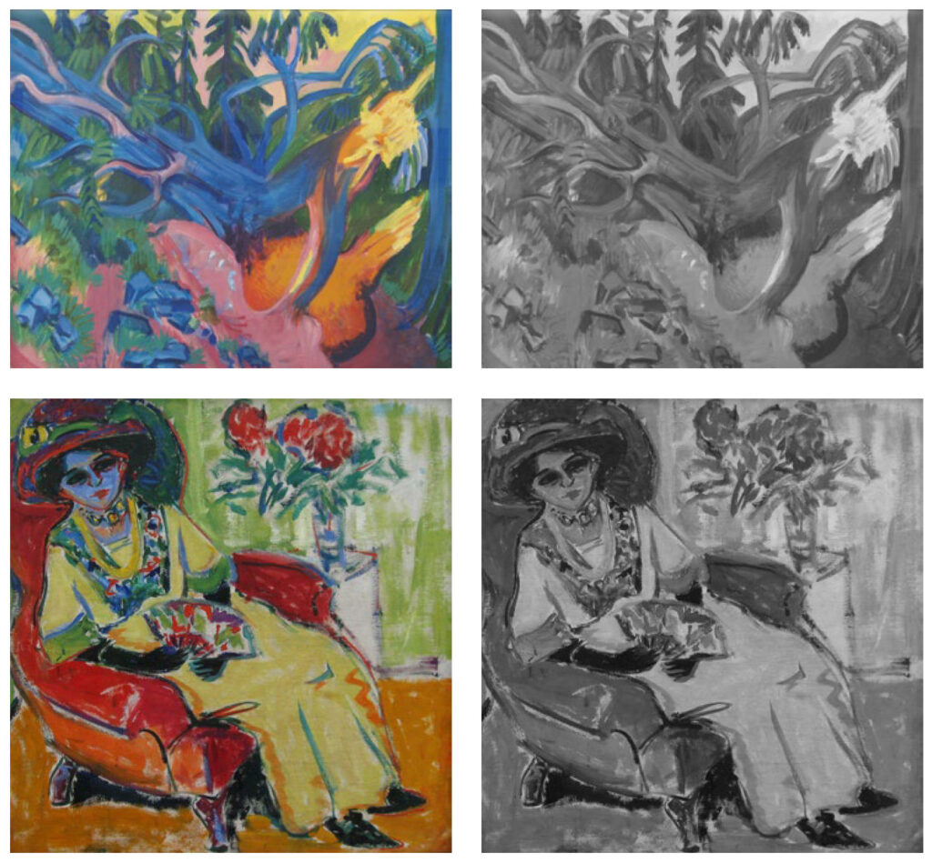
His uprooted tree in the forest is hard to recognize because the blue trunk and green leaves have similar brightness, as do the rocks near the bottom. You can see this confusion in the grayscale version.
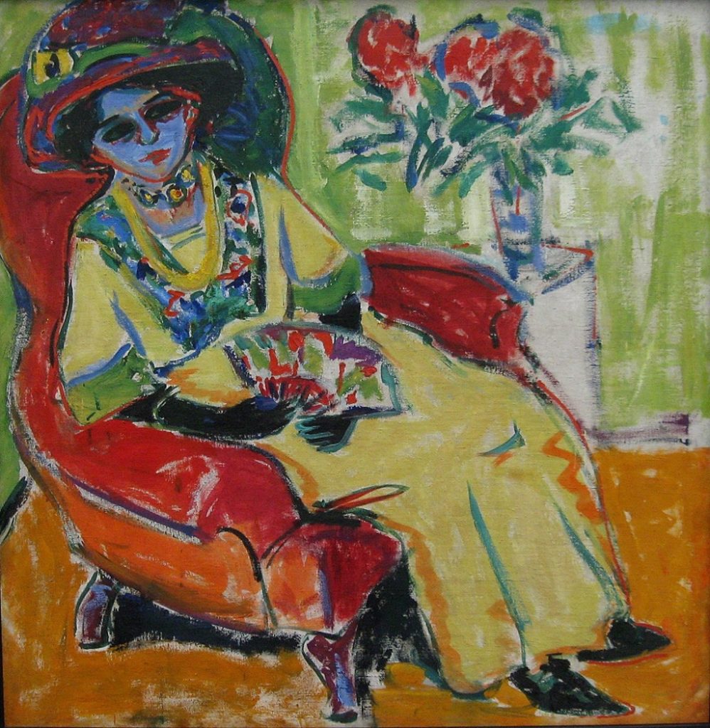
We don’t know whether Kirchner planned this deliberately, but he surely recognized the effect. His portrait of a woman with an unrealistic blue face is very different, and the face is easily recognized because her dark eyes, mouth and hair contrast normally with her lighter, albeit blue, skin.
One of the more magical effects artists can create with color is a sense of flicker or movement. Adjacent areas of equiluminant color appear unstable because they have equal brightness and do not activate recognition of form and location.
Monet used this effect strikingly in his painting Sunrise (Marine), Figure 6, which is a companion to the famous Impression, Sunrise that gave the Impressionist movement its name.
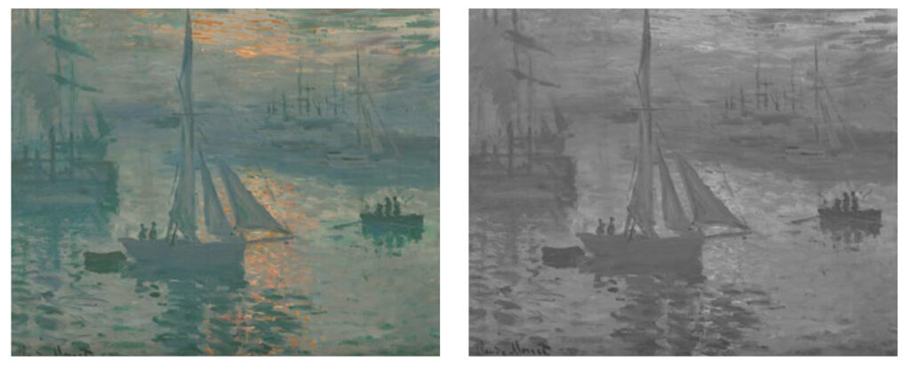
The pink reflections on the water are nearly equiluminant to their surroundings, and thus they glow and shimmer in a way that high-contrast white spots would not.
Ophthalmology has heightened my appreciation of art, and a love of art has broadened my outlook as a physician in our complex and diverse society. Medical school is long and arduous, and we might do well to keep our students in touch with the arts and history.
Michael F. Marmor, MD, is a professor of ophthalmology at Stanford, and an affiliate of the Program in Biomedical Ethics and the undergraduate Program in Human Biology. He is the author, with James Ravin, MD, of The Artist’s Eyes: Vision and the History of Art. Contact him at medmag@stanford.edu.
