Say it with sculpture
Building kinetic contraptions to bring data to life

On a wall-mounted shelf in the office of David Schneider sit two dozen or more empty Diet Coke bottles of varying shapes and sizes. They’re emblazoned with various languages, testifying to all the places he’s downed one of the beverages. He’s not a coffee drinker.
There’s also a nice bug collection displayed on the wall. Schneider, PhD, professor of microbiology and immunology, has been collecting bugs since his childhood in Ottawa, Ontario.
“I’ve always loved biology,” he says. When he was in 12th grade, he won first place in an international science contest, besting the future founder of Amazon, Jeff Bezos.
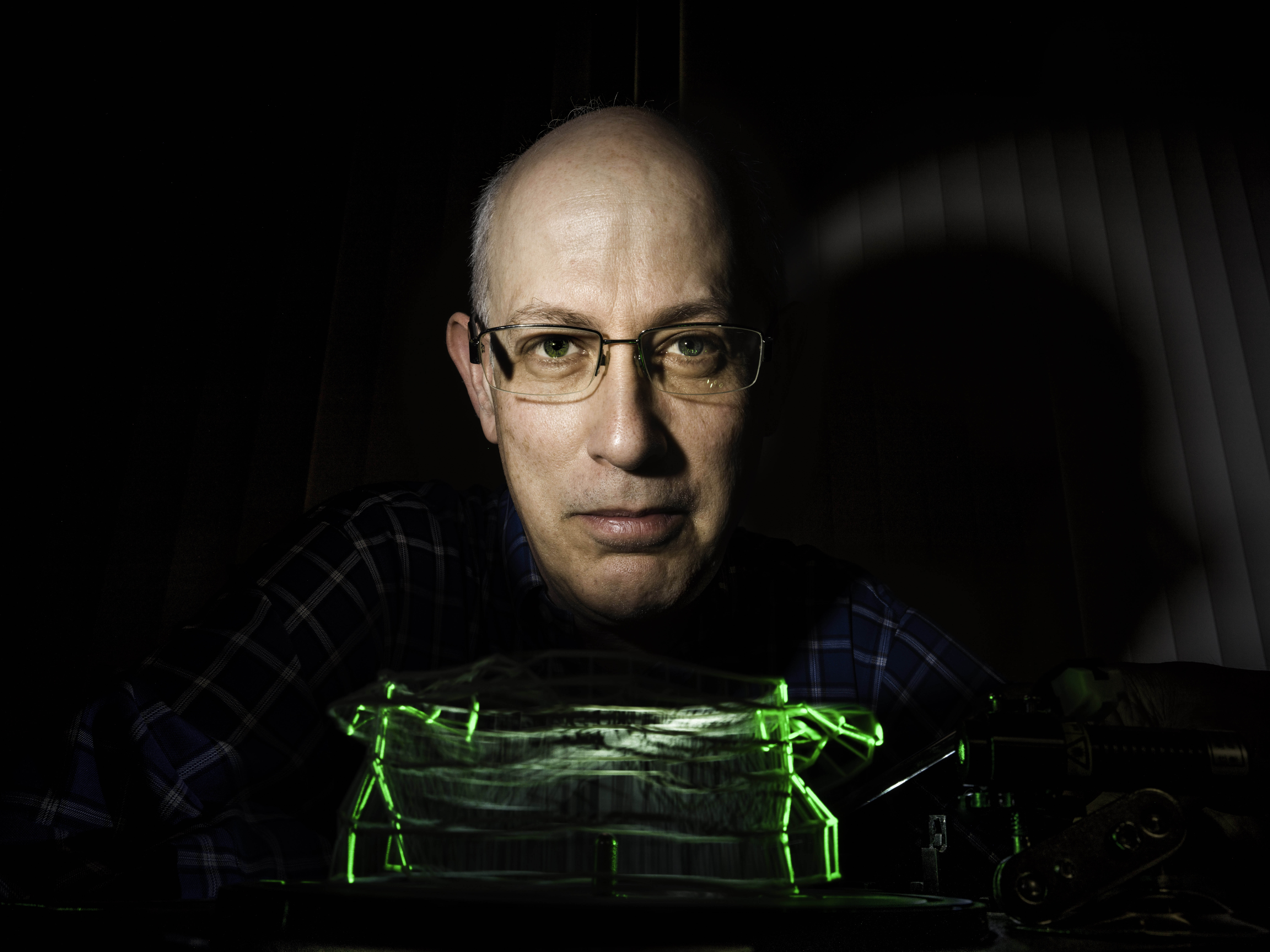
And you can’t help but notice, atop a packed bookcase, an assortment of odd little wooden contraptions. They’re kinetic sculptures that Schneider built to represent data that would otherwise be hard to comprehend.
“David’s office is a unique environment that really reflects how unique he is,” says Denise Monack, PhD, professor of microbiology and immunology, whose lab is adjacent to his. “He’s extraordinarily creative.”
If Schneider’s office seems a bit busy, it’s in part a reflection of his pace. As chair of the Department of Microbiology and Immunology, he oversees a complex of 150 people. He also teaches and does a lot of research.
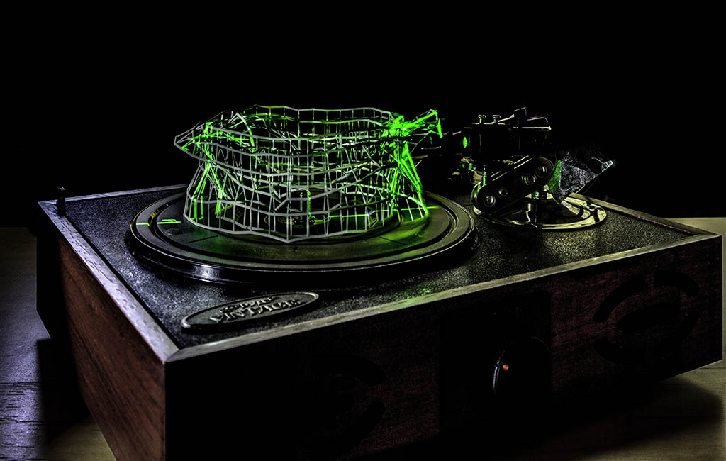
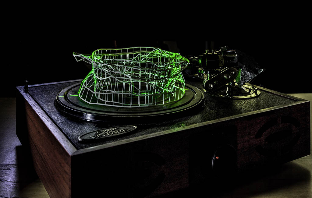
Schneider’s research generates lots of data, which is where the contraptions come in: Sometimes it makes more sense for him to plot that data in more than two dimensions. He calls his creations data sculptures.
Circular reasoning
Schneider focuses on infectious diseases and their effects on infected hosts. Getting sick and recovering are two different sides of a circular journey, he says.
“The path you take back to health isn’t the path you take to getting sick,” he says. “It’s a loop.” The precise scientific term for this kind of loop is hysteresis.
Not that the loop necessarily has to be represented as a circle. It could be depicted, for example, as a baseball diamond. When you’re first infected, you’re standing at home plate — analogous to your initial state of good health.
Then the pitch comes — that is, you are infected by who knows what — and you, the infected host, respond in one of various ways, depending on the pathogen and on your initial condition: You swing and hit the ball to left field, you bunt or the umpire calls, “Ball four!” In any case, you’re on your way to first base. At this stage, the pathogen load is increasing, and your immune system is kicking in and making you feel worse. By the time you reach second, you’re at your maximum point of sickness.
“David’s office is a unique environment that really reflects how unique he is. He’s extraordinarily creative.”
Recovery is analogous to scoring a run, having rounded all those bases. However, you can’t score, or return to full-blown health, by going in reverse from second base back to first and then home. Very different things are happening in your body when you’re approaching or standing on third base as opposed to first base. Though, from the stands, those two bases may appear juxtaposed, it would be a mistake to think first base and third base are equivalent.
The internal states of the players standing on those bases are quite different. You might want to give the third-base patient an entirely different set of medications from those suitable for a first-base patient. Maybe you should give one antimicrobials and rehydrate the other.
Take malaria. When infected humans or mice are at their sickest, they’re already well on their way to eliminating the microbes that cause the disease.


Ups and downs
Malaria infects more than 200 million people a year, making them really ill. About 400,000 of those people, mostly children, die every year, Schneider says. “We don’t have a vaccine. There’s resistance to almost all the drugs we have. We need new ways of fighting the disease.”
Schneider’s group has been doing experiments with malaria-infected mice, monitoring many aspects of their physiology. “And we notice, in these mice, that the levels of various cell types and immune-signaling chemicals in the blood go up and down as the animal gets sick, then recovers or dies.” A given drug may work only during a limited portion of this cycle.
What he’s learned from his studies is that to treat a patient most efficiently, it would be great to know when the patient got infected. But that’s somewhere between tough and impossible.
“We can’t expect a child suffering from malaria to tell us when they were bitten by an infected mosquito,” Schneider wrote in his study of malaria-infected mice and human patients published in PLOS Biology.
That study showed that infecting mice with a malaria parasite resulted in a predictable set of changes in the blood levels of nine different cell types and immune-signaling substances as the mice first got sick and then recovered or, if they got too sick, were euthanized.
By looking at the ratios and absolute levels of certain measured cell types and chemicals, the researchers could identify just where a mouse was along the looping path from health to sickness to recovery or death, and how likely it was to die barring further intervention.
“We can’t expect a child suffering from malaria to tell us when they were bitten by an infected mosquito.”
In the same study, Schneider and his colleagues extended the findings to humans by looking at blood from children who had or hadn’t been infected with malaria. Human infection, they showed, also follows a looping path, and the order of cellular and molecular ups and downs along that path rise and fall in the same sequence as in mice. That sequence provides a clue as to where a patient is in the sickness cycle, and factoring in the level of one or more blood markers in a patient might give you a good sense of how much danger he or she is in.
Nine is a big number. “If you’re measuring nine things in a sick animal, it’s hard to graph, not to mention grasp, nine different variables at one time,” Schneider says. “You can lose some information. You want to emphasize that as one thing goes up, another comes down.”
Having encountered difficulty in communicating such multivariate, circular data findings, Schneider increasingly turns to building data sculptures. One looks like a wooden rotisserie holding wooden pieces of “toast.” The “rotisserie” is actually an open-front box. Its “skewer” is a long wooden axis running horizontally from one side of the box to the other side. The axis can be turned via an externally positioned crank.
The thin pieces of “toast” skewered inside the box are in fact slim disks, each irregularly shaped in its own particular way, that act as cams.
Each cam approximates a circle whose radius keeps changing at different points along the rim. The radius of a cam at any given point represents the level, at a particular point in the sickness/recovery cycle, of one of the nine cell types or substances Schneider’s team measured in malaria-infected mouse blood.
Turning the crank
Astride each of the nine cams sits the figure of a man’s torso. The men form a line along the box’s top. When you turn the crank, they variously rise up, raising their arms to the heavens, or they sink down, arms back at their sides, as each is displaced idiosyncratically by its underlying, oddly shaped cam.
The left-most little man goes up, then the next, then the next, etc. Schneider turns the crank some more and the first little man starts to come back down even as the ones to the right of it are still rising. The rise and fall of the serially adjacent little men occur in a left-to-right ripple as the crank turns.
“It looks like a wave,” Schneider says. “You might have missed that if you were looking at numbers or a graph, or just focusing on one point in time. But when you look at it this way, you can’t help but see that there’s a wave moving through the data over time.”
By analyzing the ratios and phases and rates of the rise and fall of all of the parts of this data sculpture, Schneider has shown it may be possible to figure out where in the disease-recovery cycle a patient is.
“It looks like a wave. You might have missed that if you were looking at numbers or a graph, or just focusing on one point in time.”
The hope is to eventually be able to predict early on whether a patient is headed for recovery and, if not, how to best treat the patient based on where he or she is in the disease cycle.
“I think these sculptures show the cyclical nature of infections better than any graph I’ve been able to use previously,” Schneider says. “But I still have to figure out how to publish these things. The journals always want flat pictures. We have to find a way to get around that.”
Grant writing, too. “The proposal formats often only let you submit a flat PDF. I’ve snuck movies into my PDFs in the past. But the granting agencies immediately banned doing that.”
From 2013 through 2016, Schneider, who teaches year-round, began offering postdoctoral scholars and graduate students a 10-hour course in scientific animation. In spring 2017, Schneider switched to teaching similar classes, between quarters, in data sculpture. These classes, which are limited to a dozen students, typically attract as many as 50 applicants.
Katharine Ng, PhD, a postdoctoral scholar in bioengineering, has been Schneider’s teaching assistant for both the scientific-animation and data-sculpture courses.
“David’s always open to new visualization techniques,” she says. “He’s always looking for ways to, first, convey science to lay audiences, and, second, force his fellow scientists to confront his data in a new way, hoping that maybe they’ll catch some new aspect or perspective they might have otherwise overlooked.”
Online extra
Read more about David Schneider,’s research and artwork here.

